Whether you're editing photos to print, delivering work to clients, or creating content for social media, accurate colour matters. If your screen isn't displaying colours correctly, every editing decision you make is based on inaccurate information.
Colour calibration helps ensure what you see on your monitor matches the final result. It's one of the simplest ways to improve editing consistency and produce more reliable work.
What is colour calibration?
Colour calibration is the process of adjusting your monitor so it displays colours accurately according to recognised industry standards.
Over time, monitors naturally drift. Brightness, contrast and colour balance can all change, leading to edits that look different on other screens or when printed.
A calibrated display provides a consistent editing environment, making it easier to trust your workflow.
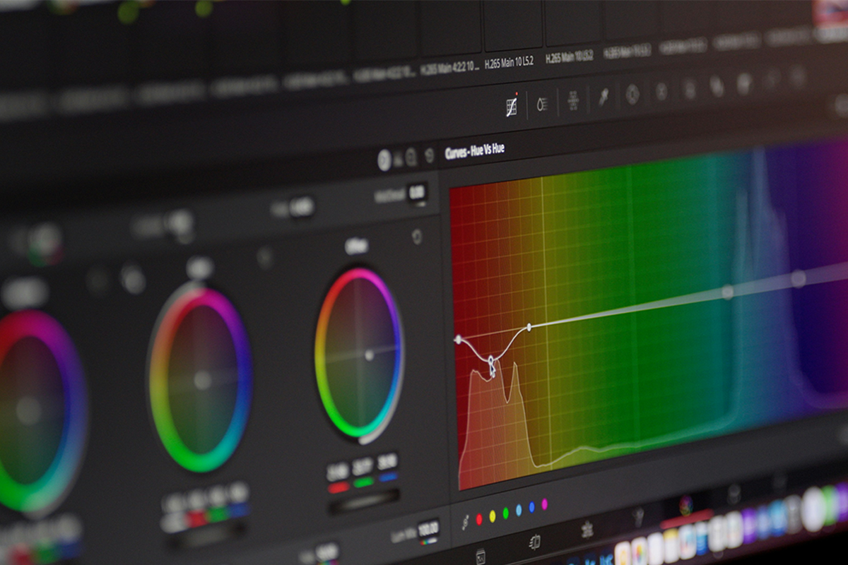
Why colour calibration matters:
Consistent editing
Without calibration, you may unintentionally edit images that are too warm, too cool, too bright or too dark. Calibration removes the guesswork and helps you make confident adjustments.
Better print accuracy
Printing is one of the biggest reasons photographers calibrate their displays. A properly calibrated monitor gives you a much closer representation of how your images will appear in print, reducing wasted paper, ink and costly reprints.
Reliable client delivery
Clients view your work across multiple devices. While every screen displays colour differently, starting with an accurate, calibrated monitor ensures you're delivering the best possible version of your images.
Consistent multi-monitor setups
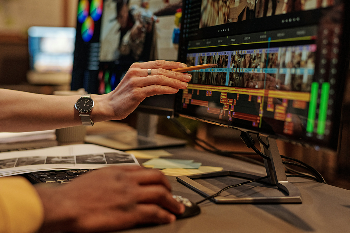
If you work across two or more displays, calibration helps keep colours consistent between screens. This is especially valuable for photographers, designers and video editors.
How often should you calibrate?
For most photographers and content creators:
- Professional photographers: Every 2-4 weeks
- Enthusiasts and hobbyists: Every 1-2 months
- Video editors and designers: Monthly
If colour accuracy is critical to your work, regular calibration is worth making part of your workflow.
How to calibrate your monitor:
- Let your monitor warm up
Turn your monitor on for around 30 minutes before calibrating. This allows the display to reach a stable operating temperature. - Control your lighting
Calibrate in the same lighting conditions you normally edit in. Avoid direct sunlight or changing room lighting, as this can affect how colours appear. - Reset your monitor
If you've made significant adjustments to brightness, contrast or colour settings, consider resetting your monitor to its factory defaults before calibration. - Use a hardware calibrator
The most accurate method is to use a dedicated calibration device. These tools measure the colours produced by your monitor and create a custom colour profile for your computer.
Popular options include:
- Calibrite Display Pro HL
- Calibrite Display 123
- Calibrite Display Plus HL
- Datacolor Spyder
- Datacolor SpyderPro
- Datacolor SpyderExpress
These devices provide significantly better accuracy than software-only calibration.
- Follow the software instructions
Each calibration device includes software that guides you through the process. Once complete, the software creates an ICC profile that your operating system uses to display accurate colours.
Recommended calibration settings:
While your requirements may vary, these settings work well for most photography workflows:
White Point:
D65 (6500K)
Gamma:
2.2
Brightness:
80–120 cd/m² (depending on room lighting)
Colour Space:
sRGB for web, Adobe RGB where applicable
If you're editing specifically for print, your print lab may recommend different targets.
Can you calibrate without hardware?
Both Windows and macOS include built-in display calibration tools. These can improve your monitor's appearance, but they rely on your eyesight rather than objective measurements.
For casual editing, they may be sufficient. For professional photography, videography or design work, a hardware calibrator remains the most accurate solution.
Colour spaces explained:
Understanding colour spaces helps ensure your work appears as intended across different platforms.
sRGB
The standard colour space for websites, social media and most digital displays. It's the safest choice for online content.
Adobe RGB
Offers a wider colour gamut than sRGB, making it popular with photographers who regularly print their work.
A calibrated monitor gives you confidence in every edit. Whether you're preparing images for print, creating content for clients or editing your latest shoot, accurate colour leads to more consistent results.
It's a small investment that can make a noticeable difference to your workflow, helping you spend less time correcting colours and more time creating your best work.