Colour Theory for Photographers
Whether you're capturing golden-hour portraits, styling a product flatlay, or editing an elegant wedding shoot, one thing always plays a starring role - colour.
It’s not just about making your images look beautiful; it’s about how they feel. And that’s where colour theory comes in.
What is colour theory?
Colour theory is a creative framework that helps artists, and photographers combine colours in a way that’s visually pleasing and emotionally impactful.
Think of your image like a conversation. Colour sets the tone. Soft pastels might whisper a gentle story, while bold, contrasting colours shout with energy. When used with intention, colour helps shape the narrative in your photography.
Meet the colour wheel
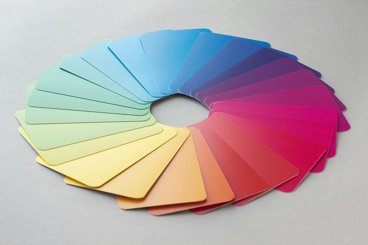
This circular guide is your go-to when working with colour combinations that work naturally together. It includes:
- Primary colours: Red, blue, yellow
- Secondary colours: Green, orange, purple (made by mixing the primaries)
- Tertiary colours: The blends in-between, like teal, coral, and mustard
The wheel is more than a visual aid, it’s a creative tool that helps you plan palettes that either pop or flow.
Colour harmony in action
Here are a few simple ways to use the wheel to your advantage:
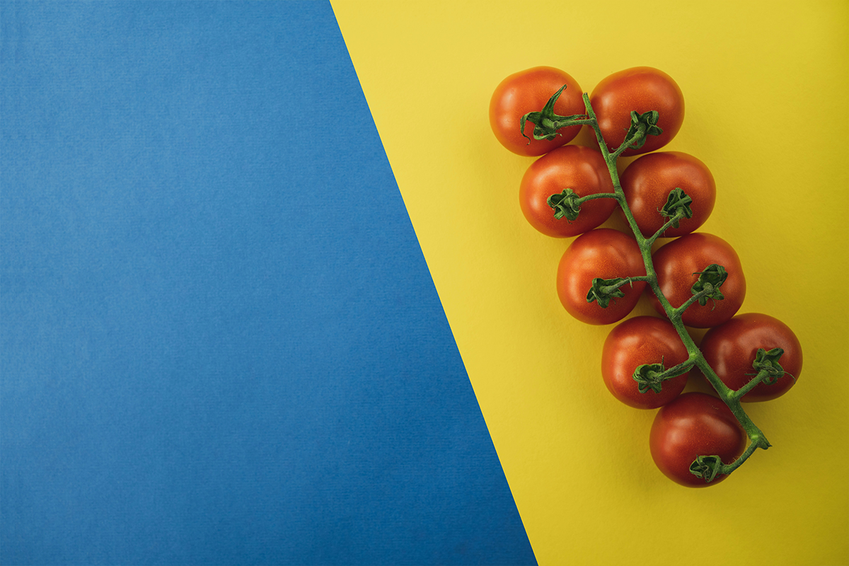
- Complementary Colours
These sit opposite each other (like blue and orange, or red and green). Think contrast, drama, and energy.
Try this: A golden dress against a rich blue sky.
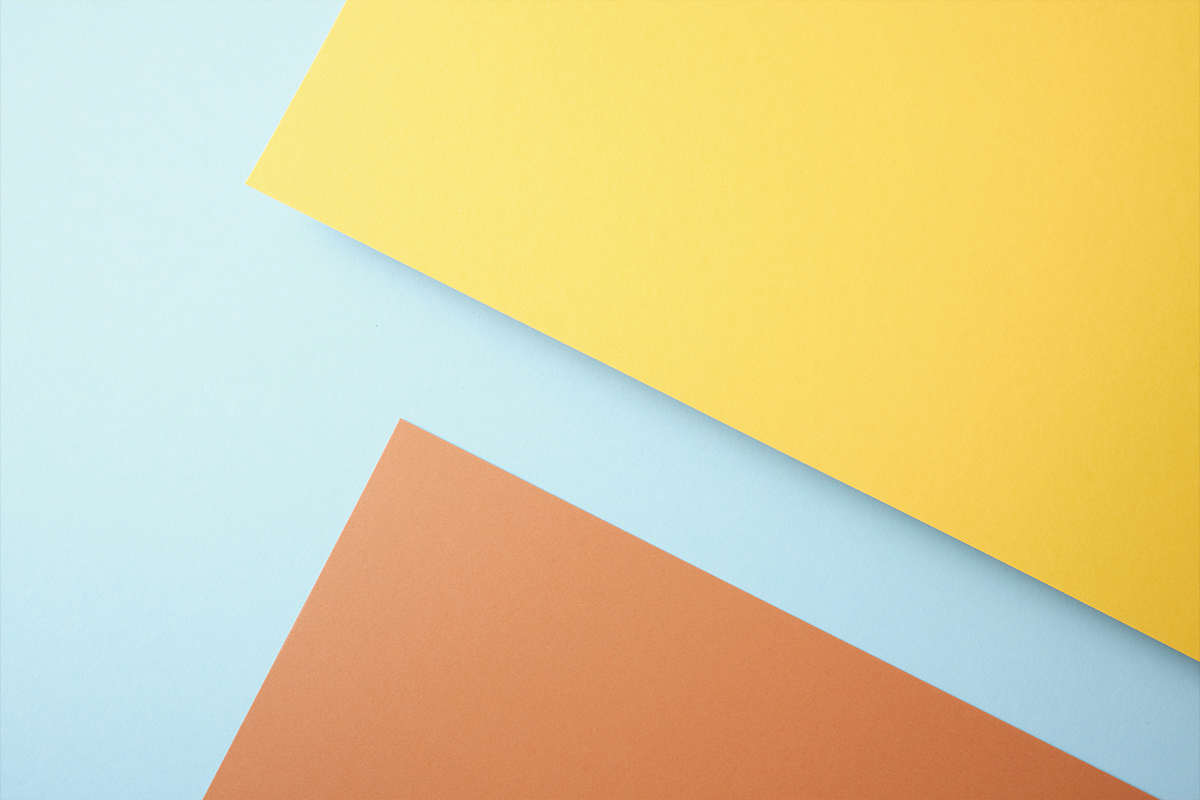
- Analogous Colours
These sit side by side (like yellow, orange, and red). Think soft transitions and natural flow.
Try this: Autumn leaves during golden hour.
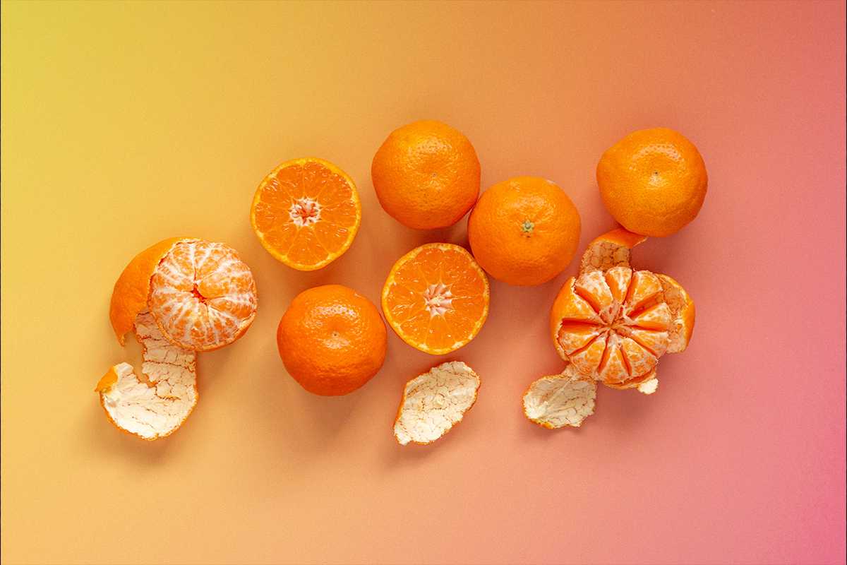
- Monochromatic Colours
Variations of one colour - different shades, tints, or tones. Clean, minimalist, and cohesive.
Try this: All-blues for a moody ocean session.
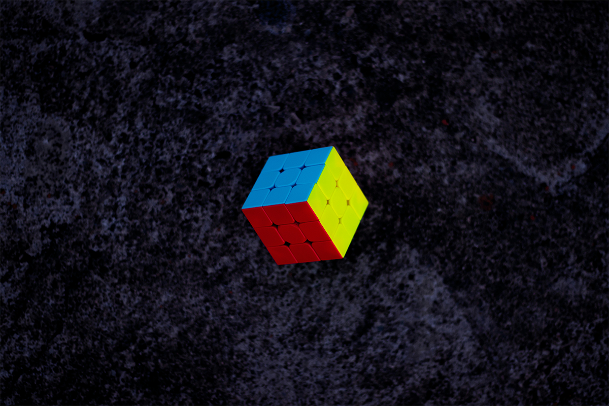
- Triadic Colours
Three colours spaced evenly on the wheel (like red, yellow, and blue). Bold but balanced.
Try this: Colourful styling for a fashion or editorial shoot.
Single colour emotion examples
- Red : Passion, love, confidence
- Blue : Calm, trust, introspection
- Yellow : Happiness, warmth, creativity
- Green : Nature, renewal, balance
- Purple : Mystery, luxury, imagination
Practical tips for photographers

Plan your palette
When scouting locations or planning wardrobe, take note of the colours in play. Think ahead!
Use colour to lead the eye
Bright colours naturally draw attention. Place them intentionally to guide focus.
Consider skin tones
Warm tones usually flatter warm skin. Cooler backgrounds can look edgy, but may need careful balancing.
Edit with intention
Whether you love moody earth tones or bright and punchy edits, stay consistent. That’s how your signature style develops.
Know the rules, then break them
Once you understand how colour works, have fun experimenting. Let your creativity lead the way.
You don’t need to be a colour theorist to take stunning photos, but having a basic understanding can make your storytelling even stronger.
Whether you’re creating dreamy tones for a soft engagement session or layering bold colours for a commercial shoot, colour is one of the most powerful tools in your creative kit.